


When you strap on a modern Apple Watch in 2025, you’re participating in a minimalist design tradition widely credited to Silicon Valley and Dieter Rams-inspired industrial aesthetics. But what if this lineage stretches further back—not to California, but to Cold War-era Eastern Europe? What if the logic, look, and even interaction principles of today’s smartwatches were quietly foreshadowed in Soviet research labs and socialist design studios nearly half a century ago?
A wave of recent horological archaeology has surfaced surprising evidence: prototypes like the 1975 Poljot Electronika and its contemporaries from East Germany and Czechoslovakia weren’t just primitive LCD curiosities. They embodied design and interface concepts that eerily resemble the stripped-down intelligence of today’s wearables. This article explores how communist-era space race ambition bled into horology, why these forgotten digital relics are philosophically closer to smartwatches than you’d think, and how collectors are rediscovering these cultural fossils as underpriced gems of proto-minimalism.
Archaeological Discovery: The Interaction Logic of the 1975 Poljot Electronika
The Poljot Electronika—technically referred to as a “space-grade electrochronometer” in some internal USSR aerospace documentation—was never mass-produced. It existed as a prototype intended for cosmonaut usage aboard Soyuz and early Salyut missions, and it was among the first timepieces in the Soviet bloc to attempt digitized timekeeping using integrated circuit technology.
While Western digital watches of the era, like the Pulsar LED or Seiko Quartz LC, focused on novelty and consumer entertainment, the Electronika prioritized interface utility under pressure—zero gravity, gloved hands, short bursts of oxygen. The core principles behind its user experience were strikingly familiar to modern smartwatch logic:
- Single-button logic tree navigation: Instead of a multi-button layout, the Electronika used a single tactile pusher to cycle between time, mission timer, and telemetry sync. This reduced the risk of mispresses during EVA or emergency procedure drills—much like how smartwatches rely on a digital crown or gesture-controlled interface for intuitive navigation.
- Low-information display design: Instead of cramming digits or extra complications, it prioritized one line of clear, large digits readable at a glance—just like the Apple Watch’s “Modular” or “Numerals Duo” faces, which maximize legibility over complexity.
- Haptic-style feedback: Though it lacked a vibration motor, the Electronika featured a mechanical switch click engineered for tactile response even through gloves—something now fundamental to smartwatch UX.
These design priorities weren’t about consumer delight. They were about survival and clarity—two values that now define how we interact with high-efficiency wrist tech.
Cultural Parallels: Communist Aesthetics and Apple’s Minimalist Utopia
Beyond interface logic, there’s a deeper, more philosophical overlap between Soviet-era electronic watches and the most iconic smartwatch of today: the Apple Watch. What could communist design possibly have in common with Cupertino’s luxury technology? Surprisingly, quite a lot.
1. Anti-ornamentation as ideology
The USSR design ethos rejected unnecessary decoration in favor of material honesty and functional clarity. This echoed the Bauhaus movement, which Apple has since embraced with fervor. Watches like the Raketa 3045 and East Germany’s Ruhla digital series embodied this: square forms, monochrome tones, stripped dials, no branding. Just function. Sound familiar?
2. Technological optimism without opulence
While Swiss brands expressed technology through fine materials and prestige, Soviet electronic watches were tools first. They imagined the future as utilitarian, egalitarian, and mission-driven. Modern smartwatches similarly downplay luxury in favor of health tracking, productivity, and lifestyle integration.
3. Monolithic casing as control
Many Soviet watches featured smooth, seamless exteriors—often single-block steel, no visible screws, brushed finishes—offering both ease of manufacturing and a kind of design silence. The Apple Watch mimics this perfectly: a glossy monobody, edges curved inward like closed lips, eschewing any visible mechanical tension.
In a strange twist, the same ideologies that once opposed Western capitalism have found reincarnation in the devices worn proudly by today’s digital elite. One could argue that the Apple Watch is a capitalist device wrapped in a communist aesthetic shell.
Undervalued Collectibles: Rare Eastern Bloc Digitals to Watch For
While Western collectors often obsess over G-Shocks, early Seikos, or LED Bulova chronographs, a niche yet passionate market is emerging for Cold War-era digital watches from behind the Iron Curtain. Here are five models now gaining traction among horology nerds and design collectors alike:
1. Poljot Electronika 5 Prototype (c. 1975)
If you can find one, this is the holy grail. Rare as hen’s teeth and rarely working, these units often show heavy corrosion due to limited casing tech. But they offer a glimpse into the Soviet vision of wearable computation long before it was fashionable.
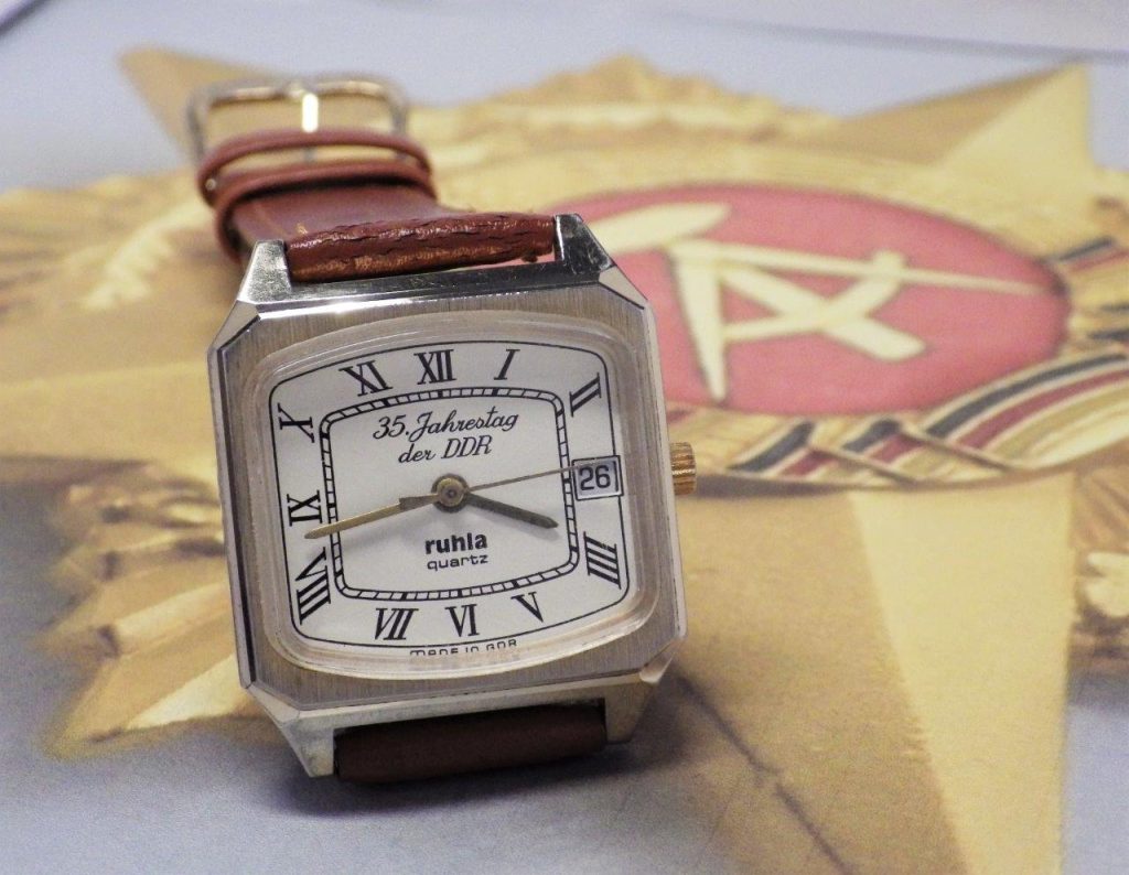
2. Ruhla Digital Quartz (GDR, early 1980s)
East Germany’s Ruhla factory released a batch of clean-lined, digital quartz watches with minimalist displays and early alarm functions. Their design now reads like mid-2010s Braun or even early Apple interface mockups.
3. Prim Sport LCD (Czechoslovakia, late 1970s)
Produced by Chronotechna, these watches experimented with edge-display layouts and alternate number fonts. They also came in surprisingly modern resin casings that foreshadowed G-Shock styling.
4. Elektronika 55 Calculator Watch (USSR)
Bulky, raw, and unapologetically industrial, this device was less about aesthetics and more about raw function. Still, its square-on-square layout and membrane buttons have made it a cult icon for lovers of brutalist tech.
5. Raketa Electro-Mechanical Hybrid
These experimental models blended analog hands with digital date or timer modules—an early nod to what we now call hybrid smartwatches. The design was elegant in a brutal way, and supply is extremely limited.
While many of these watches are more collectible for their stories than their functionality, their design relevance is now being reexamined. As AI-driven design tools begin to “rediscover” forms of minimalism, these relics suddenly look eerily current.
Conclusion
Did Soviet-era space watches predict today’s smartwatches? Maybe not in circuitry—but certainly in spirit. In their cold clarity, prioritization of function, and refusal to engage with traditional watch luxury tropes, these digital ancestors helped shape the modern wearable landscape more than we’ve acknowledged.
As Apple, Samsung, and even Swiss brands continue to chase minimalist perfection through software skins and hardware precision, perhaps it’s time we recognize that some of the earliest blueprints for this aesthetic were drafted behind the Iron Curtain. In glass offices filled with smoke and voltmeters, not marketing teams.
For collectors, these watches offer more than nostalgic curiosity. They’re artifacts of a parallel design philosophy—one that’s still shaping what we wear on our wrists today.


